Question: Which CSS3 property is used to create a responsive, fluid layout that adapts to different devices and screen sizes by adjusting font sizes and spacing?
Answer:
Media queries in CSS3 allow you to create a responsive, fluid layout that adapts to different devices and screen sizes by adjusting font sizes, spacing, and other styles.
MCQ: Which CSS3 property is used to create a responsive, fluid layout that adapts to different devices and screen sizes by adjusting font sizes and spacing?
Explanation:
Media queries in CSS3 allow you to create a responsive, fluid layout that adapts to different devices and screen sizes by adjusting font sizes, spacing, and other styles.
Discuss a Question
Related Questions
- 1. In CSS3, what is the purpose of the scaleY() function in 2D transformations?
- 2. What is the purpose of the animation-iteration-count property in CSS3 animations?
- 3. Which CSS3 property is used to create a responsive layout by specifying how an element should behave when it overflows its content box?
- 4. What does the animation-direction value "normal" indicate in CSS3 animations?
- 5. In CSS3, what is the purpose of the rotateX() function in 3D transformations?
- 6. Which CSS3 property is used to create a transition effect between two CSS property values?
- 7. What is the purpose of the animation-play-state property in CSS3 animations?
- 8. In CSS3, what is the purpose of the translateX() function in 2D transformations?
- 9. What is the purpose of the animation-fill-mode property in CSS3 animations?
- 10. Which CSS3 property is used to create responsive layouts that adapt to different screen sizes and orientations by adjusting font sizes and spacing?
You may be interested in:
Web Fundamental MCQsRecently Added Articles
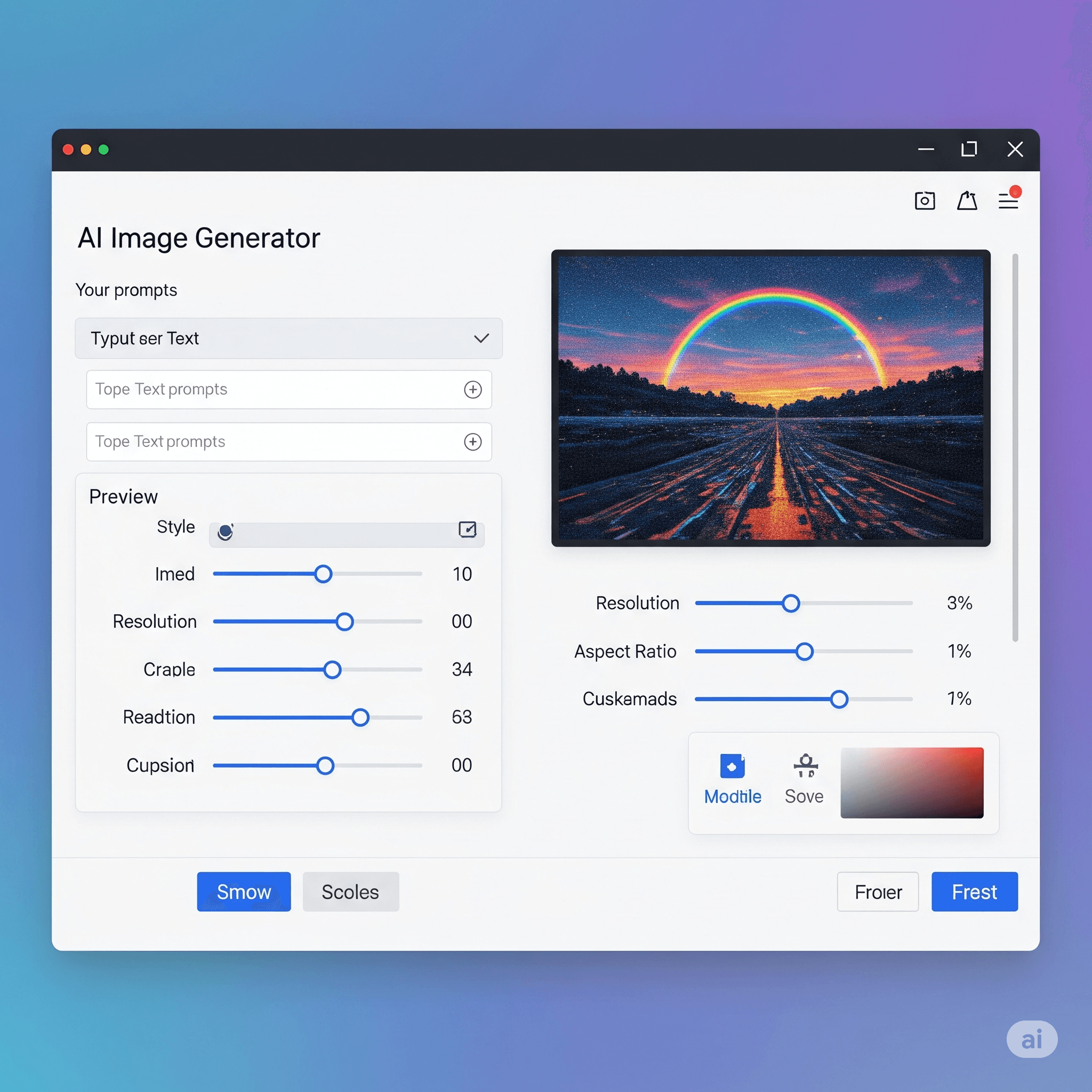
Best Free AI Image Generator of 2025: 10 Tools for Quick Photos and Video Edits
Last updated on: June 20, 2025Posted by: ExamRadar

The Importance of Ensuring a Seamless Global Experience for Your Software Applications
Last updated on: June 17, 2025Posted by: ExamRadar
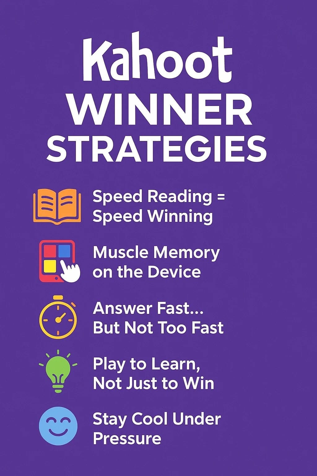
Top 5 Kahoot Winner Strategies Students Are Using Right Now
Last updated on: May 14, 2025Posted by: ExamRadar
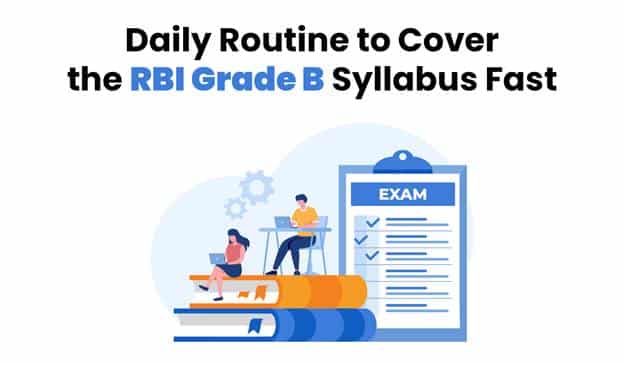
Daily Routine to Cover the RBI Grade B Syllabus Fast
Last updated on: May 14, 2025Posted by: ExamRadar

How Can AI Simplify the Academic Life of Students?
Last updated on: April 16, 2025Posted by: ExamRadar

Want to Clear IBPS RRB PO? Master These Mock Test Hacks!
Last updated on: March 10, 2025Posted by: ExamRadar

Top AI Tools for Instantly Detecting Plagiarized Writing
Last updated on: December 5, 2024Posted by: ExamRadar