Question: What is the term for the technique of using CSS media queries to specify styles for different devices or screen sizes?
Answer:
The term for the technique of using CSS media queries to specify styles for different devices or screen sizes is "Responsive design."
MCQ: What is the term for the technique of using CSS media queries to specify styles for different devices or screen sizes?
Explanation:
The term for the technique of using CSS media queries to specify styles for different devices or screen sizes is "Responsive design."
Discuss a Question
Related Questions
- 1. What is the purpose of the max-width property in media queries?
- 2. In mobile-first design, how can you ensure that large images are properly scaled and displayed on mobile devices?
- 3. What is the recommended approach for handling complex navigation menus on mobile devices in mobile-first design?
- 4. What does the @media rule in CSS typically contain in a media query for larger screens in a mobile-first design?
- 5. In a mobile-first design, what is the primary focus when choosing which content to display?
- 6. What is the role of the initial-scale property in the viewport meta tag in mobile-first design?
- 7. What is JavaScript?
- 8. Which keyword is used to declare a variable in JavaScript?
- 9. How do you write a single-line comment in JavaScript?
- 10. What is the purpose of the `typeof` operator in JavaScript?
You may be interested in:
Web Fundamental MCQsRecently Added Articles
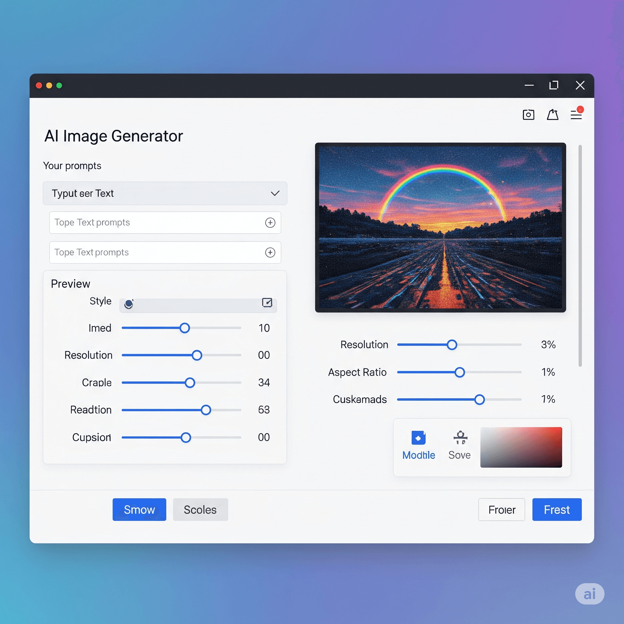
Best Free AI Image Generator of 2025: 10 Tools for Quick Photos and Video Edits
Last updated on: June 20, 2025Posted by: ExamRadar

The Importance of Ensuring a Seamless Global Experience for Your Software Applications
Last updated on: June 17, 2025Posted by: ExamRadar

Top 5 Kahoot Winner Strategies Students Are Using Right Now
Last updated on: May 14, 2025Posted by: ExamRadar
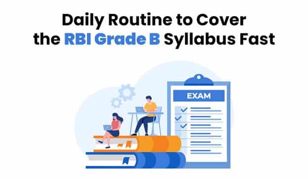
Daily Routine to Cover the RBI Grade B Syllabus Fast
Last updated on: May 14, 2025Posted by: ExamRadar

How Can AI Simplify the Academic Life of Students?
Last updated on: April 16, 2025Posted by: ExamRadar

Want to Clear IBPS RRB PO? Master These Mock Test Hacks!
Last updated on: March 10, 2025Posted by: ExamRadar

Top AI Tools for Instantly Detecting Plagiarized Writing
Last updated on: December 5, 2024Posted by: ExamRadar