Question: What is a "breakpoint" in the context of fluid grids and responsive web design?
Answer:
In fluid grids and responsive web design, a "breakpoint" is a point where the layout and design of a webpage adapt to different screen sizes to ensure a good user experience.
MCQ: What is a "breakpoint" in the context of fluid grids and responsive web design?
Explanation:
In fluid grids and responsive web design, a "breakpoint" is a point where the layout and design of a webpage adapt to different screen sizes to ensure a good user experience.
Discuss a Question
Related Questions
- 1. Which CSS unit of measurement is commonly used for creating flexible and responsive layouts in fluid grids?
- 2. What does the CSS max-width property do in a fluid grid layout?
- 3. Which CSS property is used to make an image scale fluidly with its parent container in a responsive layout?
- 4. What is the purpose of using percentage-based widths in fluid grids?
- 5. What is the role of media queries in fluid grid-based responsive design?
- 6. What is the purpose of the flex-wrap property in a responsive flexbox layout?
- 7. In a responsive grid layout, how can you ensure that the number of columns adjusts based on the screen size?
- 8. What does the flex-grow property control in a responsive flexbox layout?
- 9. What is the purpose of using relative units like em and rem in responsive typography?
- 10. In a responsive layout, what is the role of the CSS overflow property?
You may be interested in:
Web Fundamental MCQsRecently Added Articles
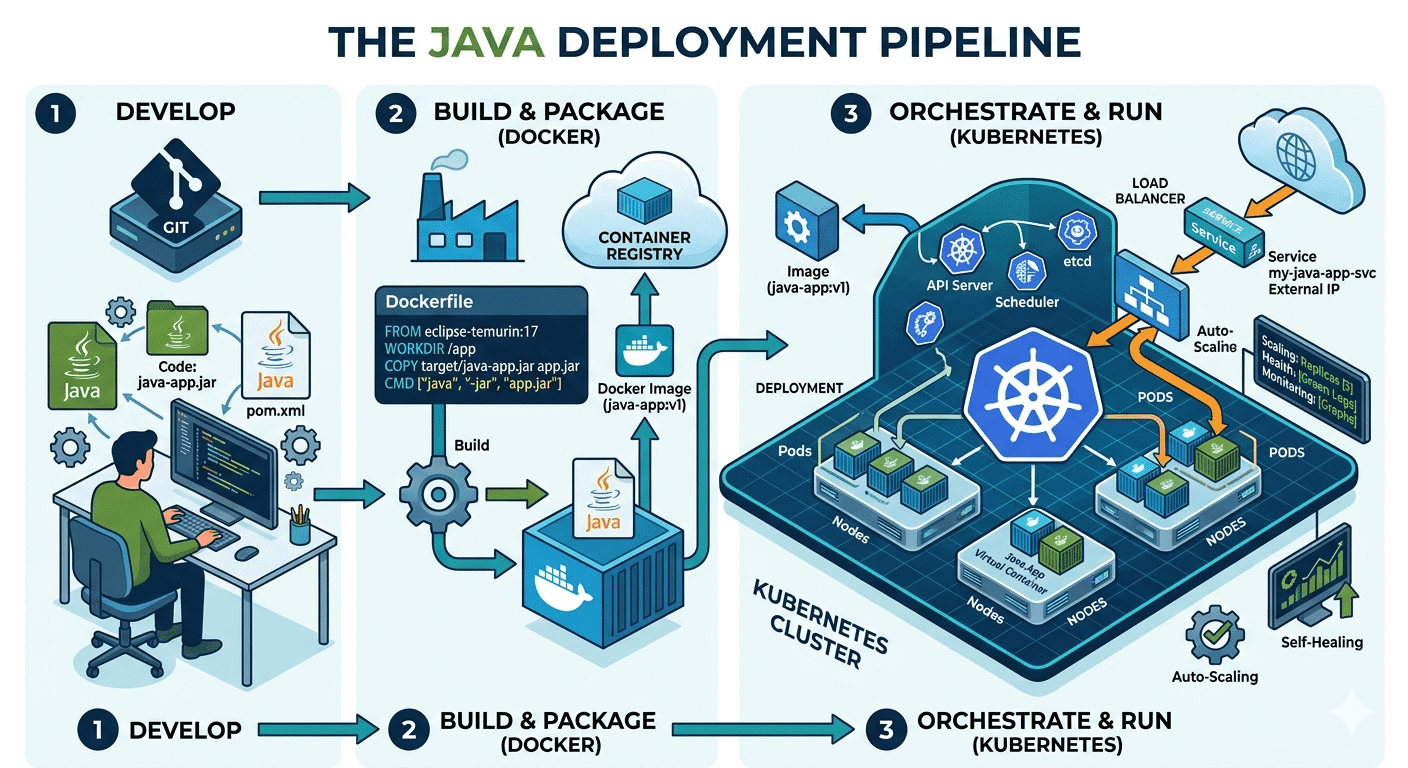
How Do Java Development Teams Use Docker and Kubernetes to Deploy Applications?
Last updated on: April 24, 2026Posted by: ExamRadar

AI vs Machine Learning: Key Differences Every Professional Should Know
Last updated on: February 13, 2026Posted by: ExamRadar

Office Cleaning Services That Elevate Sydney Offices
Last updated on: February 11, 2026Posted by: ExamRadar

What You Actually Learn About Exam Patterns From RBI Grade B Previous Year Papers?
Last updated on: February 9, 2026Posted by: ExamRadar

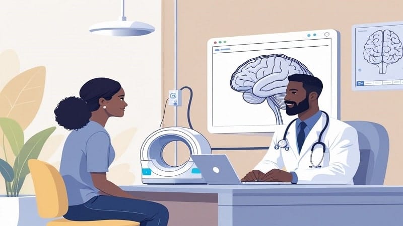
Mental Health Support That’s Closer Than You Think
Last updated on: January 7, 2026Posted by: ExamRadar
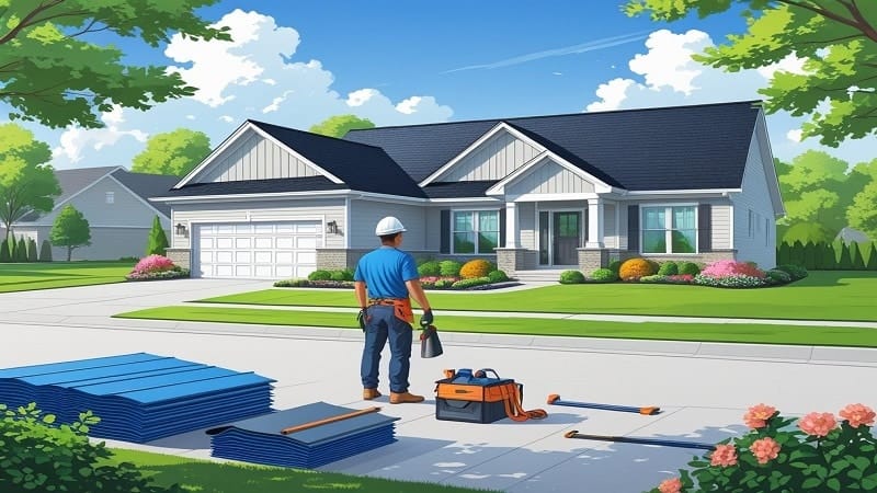
Transform Your Home’s Exterior with Columbus roofing company
Last updated on: November 27, 2025Posted by: ExamRadar