Question: What is the term for designing a website layout that works on both mobile and desktop screens without the need for media queries?
Answer:
Designing a website layout that works on both mobile and desktop screens without the need for media queries is called "adaptive design."
MCQ: What is the term for designing a website layout that works on both mobile and desktop screens without the need for media queries?
Explanation:
Designing a website layout that works on both mobile and desktop screens without the need for media queries is called "adaptive design."
Discuss a Question
Related Questions
- 1. What is the role of media queries in mobile-first design?
- 2. In mobile-first design, what is the recommended practice for handling large background images?
- 3. What is the term for designing for mobile devices first and progressively enhancing the design for larger screens?
- 4. What is the key advantage of using a mobile-first design approach in responsive web design?
- 5. In mobile-first design, what does the CSS property display. none; do?
- 6. What is the primary goal of mobile-first design principles in responsive web design?
- 7. Which CSS technique is used to adjust the layout and styling of a website based on the screen size and device characteristics?
- 8. What is the purpose of the viewport meta tag in mobile-first design?
- 9. What is the role of media queries in mobile-first design?
- 10. In mobile-first design, what is the recommended practice for handling large background images?
You may be interested in:
Web Fundamental MCQsRecently Added Articles
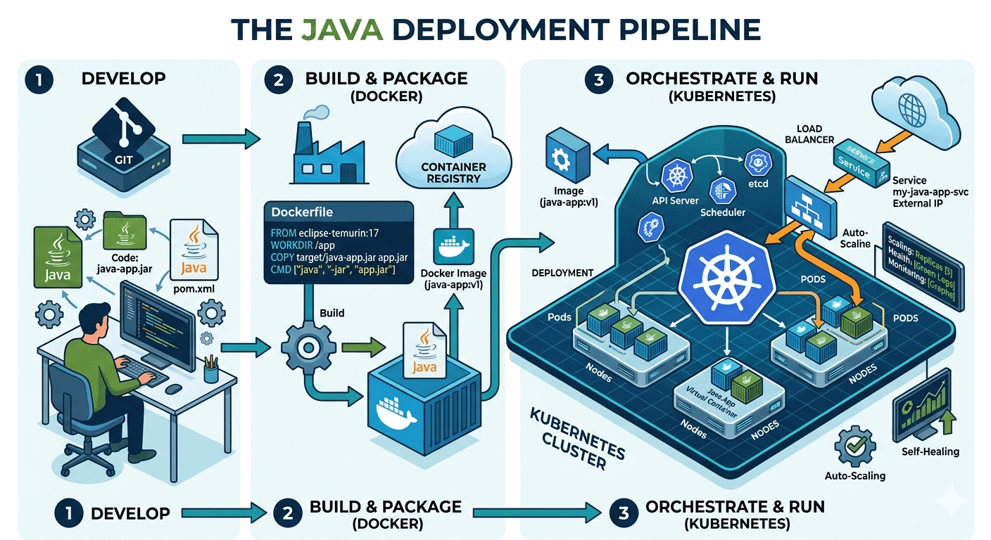
How Do Java Development Teams Use Docker and Kubernetes to Deploy Applications?
Last updated on: April 24, 2026Posted by: ExamRadar

AI vs Machine Learning: Key Differences Every Professional Should Know
Last updated on: February 13, 2026Posted by: ExamRadar

Office Cleaning Services That Elevate Sydney Offices
Last updated on: February 11, 2026Posted by: ExamRadar

What You Actually Learn About Exam Patterns From RBI Grade B Previous Year Papers?
Last updated on: February 9, 2026Posted by: ExamRadar

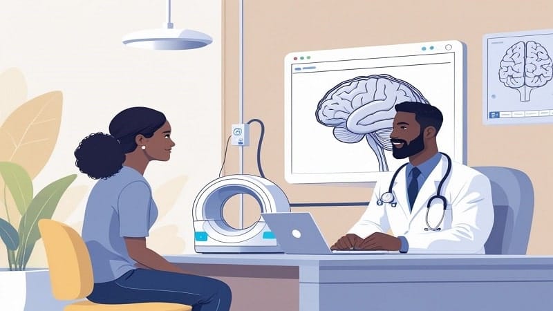
Mental Health Support That’s Closer Than You Think
Last updated on: January 7, 2026Posted by: ExamRadar
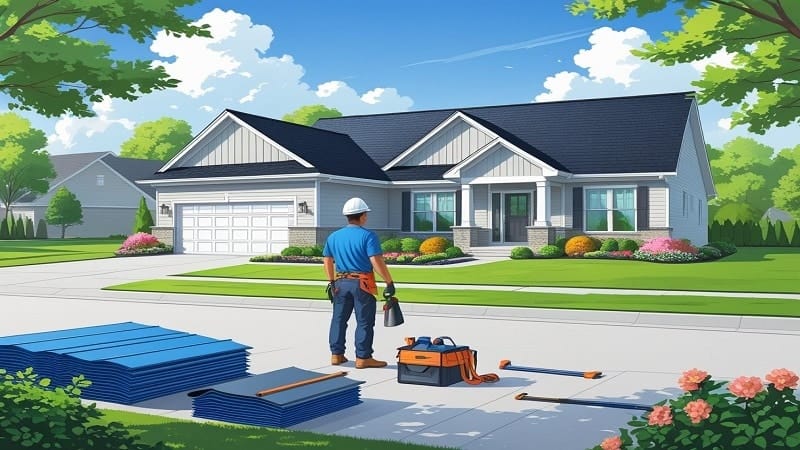
Transform Your Home’s Exterior with Columbus roofing company
Last updated on: November 27, 2025Posted by: ExamRadar